
The Physics of Capillary Flow and Tine Mechanics: Why Calligraphy Cannot Tolerate Guesswork
Calligraphy is not decorative doodling; it is an applied physics experiment in fluid dynamics and material elasticity. When a flexible pointed steel nib—whether a vintage Gillott 303, a Leonardt Principal EF, or a Japanese Zebra G—contacts paper, it operates under Hertzian contact mechanics. Downward manual pressure forces the two tempered steel tines to splay apart. Surface tension holds the reservoir of iron gall or walnut ink in a suspended meniscus between the tines until capillary action draws the fluid into the micro-fissures of cellulose paper fibers.
To produce the breathtaking swell-and-hairline contrast of English Roundhand or Spencerian script, the penman must modulate pressure from fractions of a gram (hairlines) to tens of grams (shaded swells) within a span of three milliseconds. If the physical guidelines beneath the nib are imprecise, or if the main slant wavers by even two degrees, the optical harmony of the script collapses into visual dissonance. Letter spacing, ascender loops, and descender tails demand mathematically rigid reference geometry.
The $25 Paper Pad Racket vs. Pure Open Vector Precision
Walk into any boutique art supply store and you will find pre-printed calligraphy practice pads retailing for fifteen to twenty-five dollars. Inside are twenty sheets of low-grade paper with thick, distracting black lines printed at a single arbitrary angle. Worse still, modern subscription-based mobile apps demand recurring monthly payments just to generate a basic PDF grid, embedding tracking telemetry and bloated watermarks.
The TOOL GIGA Calligraphy Guideline Generator provides an uncompromised, zero-dependency alternative. No registrations, no paywalls, no tracking scripts. Pure mathematical algorithms render crisp vector SVG guidelines directly on your device, calibrated to exact millimeter dimensions and print-ready for standard A4 paper at zero cost.
Four Centuries of Penmanship: From Copperplate Engravings to Spencerian Ovals
Different script families require fundamentally distinct geometric matrices:
- Copperplate (English Roundhand & Engrosser’s Script): Born in 18th-century London when masters like George Bickham (The Universal Penman, 1743) engraved handwritten scripts onto copper printing plates. It mandates a strict 55-degree main slant and classical 3:2:3 or 2:1:2 ratios between ascenders, lowercase x-heights, and descenders.
- Spencerian Script & Ornamental Penmanship: Developed in 1850 by Platt Rogers Spencer in Geneva, Ohio. Spencer drew inspiration from nature’s curves—rolling river waves and the elliptical profiles of water droplets. Spencerian features an acute 52-degree slant, an ultra-compact x-height (often 2mm to 3mm), and exaggerated 3:1:3 ascender loops for magnificent flourishing.
- Italic & Broad-Edge Chancery: Originating in Renaissance Italy with Ludovico Vicentino degli Arrighi’s 1522 manual La Operina. Rather than flexible point pressure, line thickness is governed by the fixed width of a chisel-edged nib held at a 45-degree angle, with letters inclined at a gentle 5-degree slope (85° from horizontal).
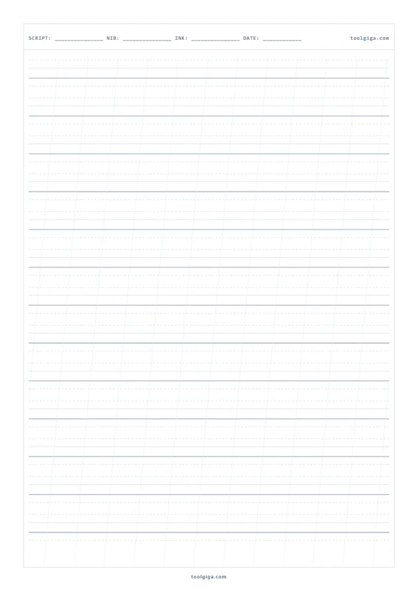
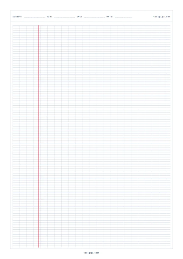
- French Seyès (Grands Carreaux): Codified during Jules Ferry’s 1880s French educational reforms. It features an 8mm major horizontal band subdivided by 2mm auxiliary lines (interlignes) and 8mm vertical cross-lines, accompanied by a 30mm left margin line (la marge). It remains the global gold standard for cursive penmanship discipline.
Dual-Contrast Engineering: Direct Practice vs. LED Light Box Tracing
Professional calligraphers write on diverse surfaces, and a single line weight cannot satisfy every workflow. Our generator provides two dedicated contrast paradigms:
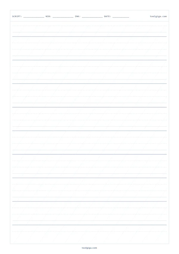
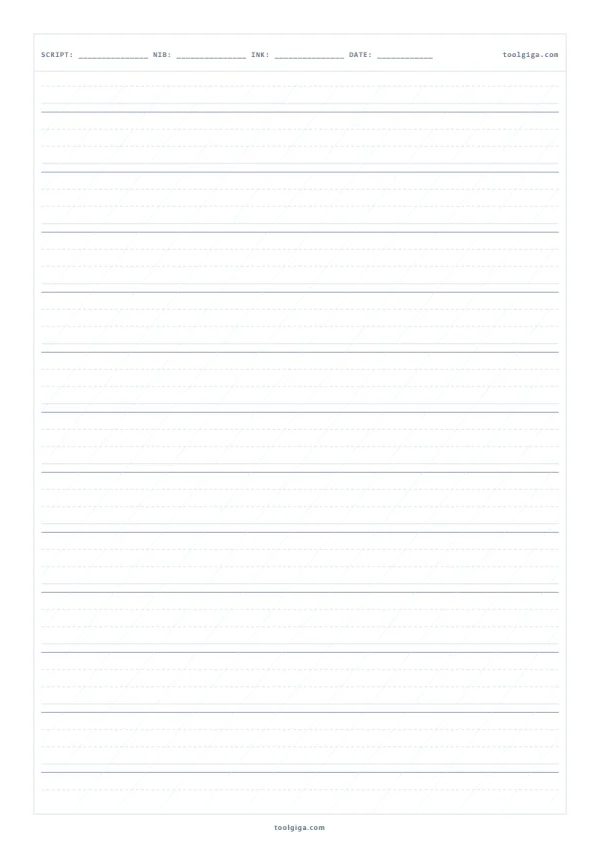
Direct Practice Mode (Soft Gray & Cyan): Calibrated with ultra-delicate lines (#cbd5e1 and #94a3b8) that provide visual orientation without dominating the finished artwork. The guidelines recede into the background, allowing your dip pen ink strokes to stand out cleanly.
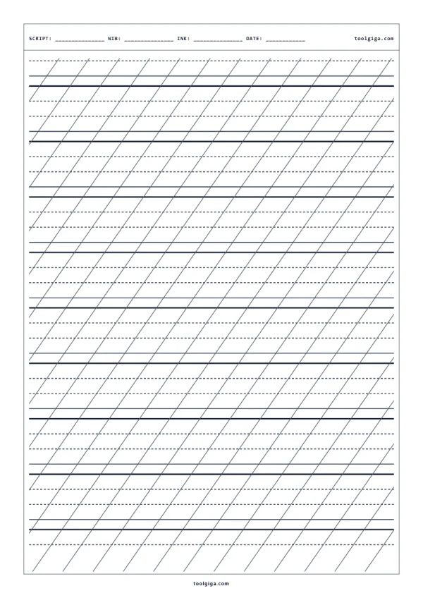
Light Box / Tracing Mode (High-Contrast Black): Engineered for artists working on heavy, opaque stock—such as 300 gsm Arches hot-press watercolor paper, handmade cotton wedding stationery, or dark envelope stock. In this mode, lines are rendered with high-contrast vector black (#0f172a), allowing them to project clearly through heavy paper when placed on an illuminated LED tracing pad.
Custom Slant Density and Archival Metadata Headers
A frequent flaw in automated guide generators is the "prison bar effect"—cluttering the sheet with slant lines every three millimeters until the page becomes visually dizzying. Our generator gives you total control over slant frequency: Dense (every 8mm for novices), Medium (every 15mm), Sparse (every 25mm), or Slant Lines Off for advanced hand control.
Additionally, each sheet can include an archival header row to record your equipment: SCRIPT, NIB, INK, and DATE. This turns every printed practice sheet into an organized laboratory record of ink viscosity, paper tooth, and nib flexibility.